Nova

I worked on the web design for Nova: a high-end e-commerce platform specializing in essential tech products for a high-end lifestyle. The project focuses on connecting cutting-edge technology with sophisticated aesthetics.

00

Problem

In a saturated electronics market, many e-commerce platforms overwhelm users with cluttered interfaces, aggressive marketing banners, and complex navigation. This "digital noise" makes it difficult for customers to find high-quality products and trust the premium nature of the items. Additionally, many tech stores fail to provide a seamless transition between mobile and desktop experiences, leading to high cart abandonment rates due to a lack of visual hierarchy and intuitive checkout flows.

Solution

A minimalist, mobile-first e-commerce solution that prioritizes clarity, elegance, and user autonomy. By implementing a "content-first" design philosophy, It eliminated unnecessary distractions, allowing the product photography and key specifications to take center stage. The solution features a responsive grid system, intuitive category filtering, and a streamlined "one-tap" purchase intent, ensuring that the journey from discovery to checkout is as premium as the products themselves.

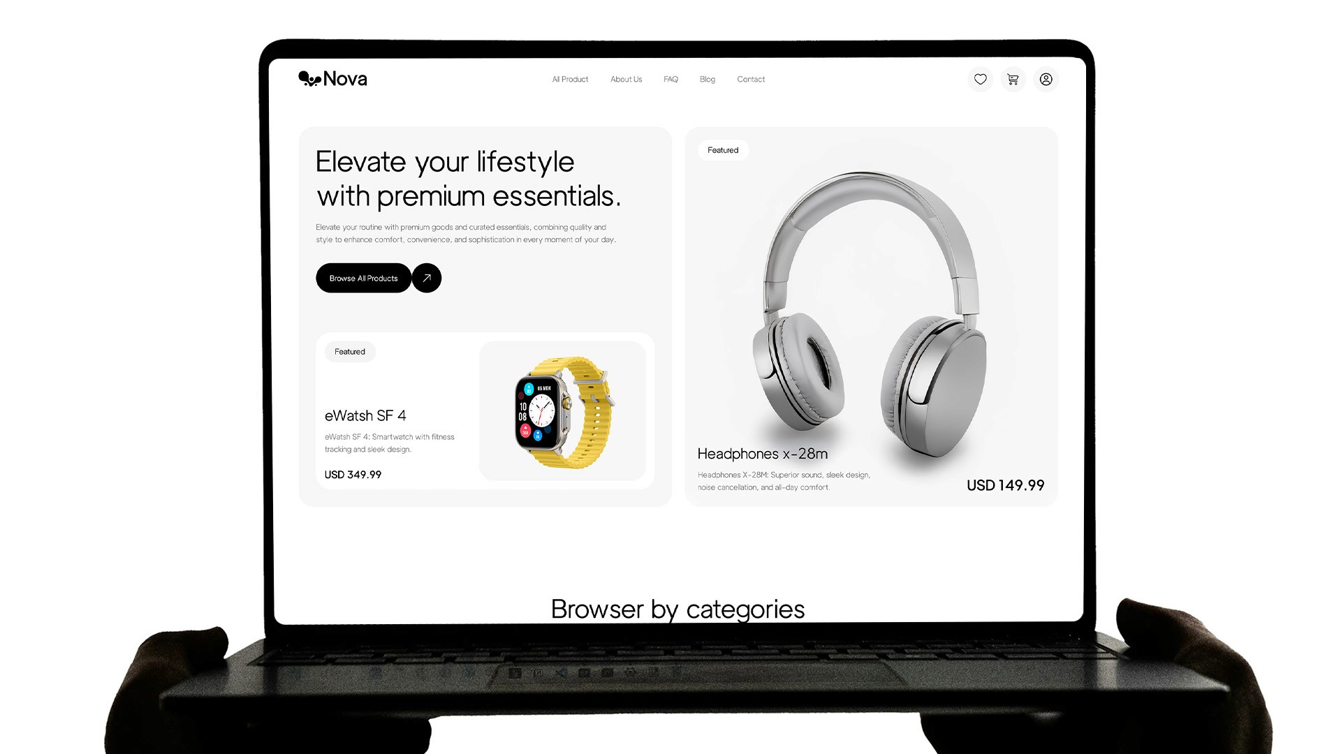
The inspiration for Nova stemmed from the realization that technology is no longer just a tool, but a fundamental part of our personal style and daily environment. While tech products were becoming more elegant, the platforms selling them remained stuck in a "big-box retailer" aesthetic. The goal was to design a digital space that felt like a high-end boutique—where the interface acts as a quiet, sophisticated backdrop to the innovation it showcases.

Year

2025

Year

2025

Year

2025

Year

2025

Timeframe

45 days

Timeframe

45 days

Timeframe

45 days

Timeframe

45 days

Tools

Figma

Tools

Figma

Tools

Figma

Tools

Figma

Category

UI/UX

Category

UI/UX

Category

UI/UX

Category

UI/UX

01

The mobile view leverages vertical storytelling for the blog and testimonials. It focused on large touch targets and balanced typography to ensure a premium, readable experience for users on the move.

02

The homepage uses a modular grid to balance product discovery with lifestyle content. A clear visual hierarchy is stablished. This guides users seamlessly from high-level categories to detailed social proof.

03

By identifying the pain point of user overwhelm, a mobile interface was designed centered on clarity. The solution uses highlighted product cards to make premium tech discovery simple and enjoyable for the user.

04

Product page is designed as a comprehensive journey, integrating technical specs, bundled offers, and FAQs. This structure reduces friction by addressing all user concerns within a single, cohesive flow.

05

The tablet interface maximizes screen real estate for immersive product imagery. 'Buy Now' section is optimized with accessible touch targets and clear shipping information to boost conversion confidence.

06

The shop layout features a refined filtering system and minimalist product tiles. This design allows users to compare premium essentials quickly while maintaining the brand's high-end aesthetic appeal.

07

Minimalist design system using Luxora Grotesk and a neutral palette. This foundation ensures brand consistency and prioritizes legibility across all digital touchpoints and device types.

Say Hello!

I'm open for new projects, feel free to contact me to see how can we collaborate

Say Hello!

I'm open for new projects, feel free to contact me to see how can we collaborate

Say Hello!

I'm open for new projects, feel free to contact me to see how can we collaborate

Say Hello!

I'm open for new projects, feel free to contact me to see how can we collaborate