Elyon
I worked on branding and app development for Elyon: A comprehensive travel and tourism platform designed to simplify the discovery and booking of premium global destinations.
00

Problem
In an oversaturated travel market, users often struggle with fragmented booking experiences and overwhelming interfaces that lack visual clarity. Many travel applications fail to provide a seamless transition between destination inspiration and the actual logistics of securing tickets. This disconnect frequently leads to user fatigue, high abandonment rates during the signup process, and a lack of emotional connection with the brand, making the planning of a simple vacation feel like a complex administrative task.
Solution
Elyon redefines the travel experience through a sophisticated mobile application that harmonizes aesthetic inspiration with functional efficiency. By implementing an intuitive UX-UI framework, the app bridges the gap between exploration and action. The design prioritizes a "content-first" approach, utilizing high-fidelity imagery, a clean minimalist layout, and a streamlined booking flow. Through a cohesive brand identity and a friction-free interface, Elyon provides a trustworthy environment where users can plan their journeys with absolute ease and confidence.
The inception of Elyon was driven by the necessity to humanize the digital travel industry through strategic branding and user-centric design. The project began with a deep exploration of "the traveler’s psyche," identifying that the modern user seeks both security and adventure. The brand identity was built upon a palette of Primary Blue and vibrant accent tones, such as orange and yellow, to evoke a sense of trust, energy, and the warmth of a new destination. This visual language was carefully crafted to ensure that every touchpoint reflects a premium yet accessible service.
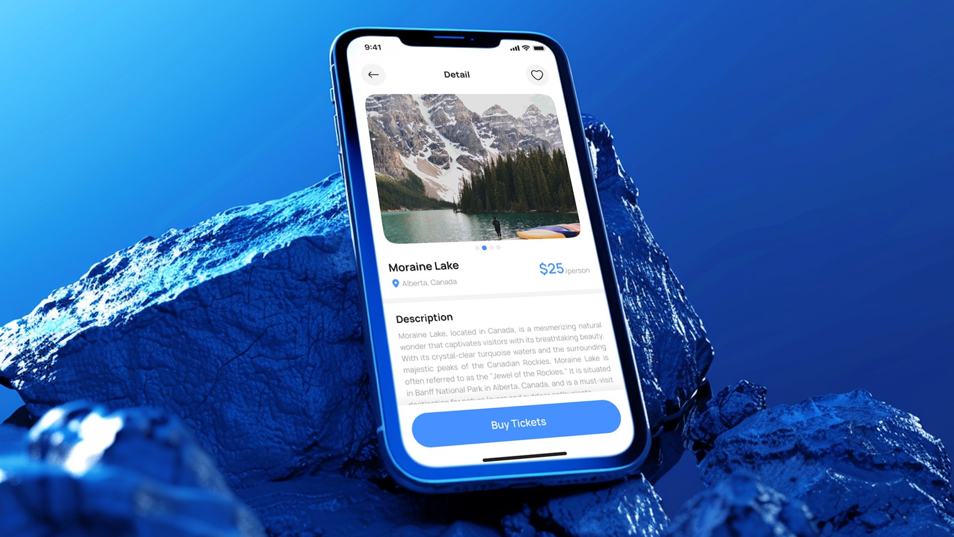
The design phase focused on solving the complexity of travel logistics through a rigorous UI kit and component system. A custom iconography set was developed to provide immediate visual cues, reducing cognitive load across the search and booking modules. Particular attention was paid to the "Booking Flow" and "Account Verification" screens, where the interface utilizes soft shadows, generous white space, and clear call-to-action buttons. These elements work together to guide the user through the conversion funnel without the friction typical of traditional travel platforms.
To ensure long-term scalability and brand recognition, a robust design system was established, centering on the "E-Wing" logo which symbolizes both flight and fluidity. The final product is a harmonious ecosystem where the typography, color theory, and micro-interactions serve a single purpose: making the world more accessible. By integrating seamless Google authentication and a curated "Recommendation" engine, Elyon stands as a testament to how thoughtful design can transform a utilitarian transaction into an inspiring journey of discovery.
01

02

03

04

05

06

07

08

09

010

011

012

013

014

see also


